Watercolour has a reputation in primary schools: beautiful to look at, impossible to teach, a mess to clean up. Teachers have moved towards acrylics and markers because watercolour feels unpredictable. Students fear the medium because they worry about "ruining" their work.
But watercolour teaches something no other medium can. It teaches water control. It teaches transparency. It teaches respecting the paper and working with accident and flow rather than against them. Those are genuine artistic skills that develop problem-solving and resilience.
The barrier to watercolour isn't the medium itself. It's the classroom setup.
Get the setup right, and watercolour becomes not just possible but preferred. Teachers discover their students are more engaged, more experimental, and more willing to take artistic risks. The "happy accidents" that watercolour creates become the heart of the artistic discovery.
This post maps 10 watercolour lessons to the Australian Curriculum, with practical classroom strategies built in. Each lesson is designed to teach a specific watercolour technique while connecting to Australian places, themes, or curriculum content.
The Critical Watercolour Setup: Why It Matters
Before the lessons, let's solve the problem that keeps watercolour out of classrooms.
Paper: This is the most common failure point. Regular copier paper (80gsm) buckles and tears under water. A student gets discouraged immediately and decides "watercolour doesn't work". The solution: watercolour paper (cold-pressed, minimum 200gsm) or heavy cartridge paper (minimum 200gsm). Pre-cut sheets, one per student. This costs slightly more but prevents total failure.
Water management: Each student needs a water container with fresh water. Pre-fill containers before the lesson starts. Set up a two-cup system: one cup for rinsing the brush (dirty water), one for clean water. Change these halfway through the lesson. Dirty water makes muddy colours. Clean water teaches colour mixing properly.
Paint format: Watercolour discs or pans are better than tubes in a classroom. They're less wasteful, easier to distribute, and more contained. A student can't squeeze out half a tube by accident. Discs dry out, but they rehydrate instantly with water; tubes are messier to share and control.
Drying: Don't stack wet watercolours on top of each other. Set up wire drying racks or line paintings on a flat surface, spacing them so they don't touch.
Smocks: Unlike acrylic, watercolour washes out of most clothing. Smocks are less critical but still useful for preventing wet paint on sleeves and trousers.
Get these five things right, and watercolour becomes manageable.
1. Australian Wildflower Fields: Wet-on-Wet and Fine Detail
Year level: Years 3-5
Curriculum focus: ACARA Visual Arts code AC9AVA4E01 (Exploring and practising art techniques), Science code AC9S3U01 (Biological sciences)
Technique: Wet-on-wet background washes, wet-on-dry detail work, colour mixing for botanical accuracy
Australian wildflowers are a natural entry point for watercolour. Banksias, bluebells, desert peas, waratah. Each has distinct colours and forms.
The lesson structure works in two stages. First, wet-on-wet: students wet their entire paper with clean water and a large soft brush. While the paper is wet, they drop in dilute watercolour, letting colours blend and move. This creates a loose, organic background.
Once this dries (it'll be dry in minutes to a few minutes depending on room humidity), students switch to wet-on-dry: detailed flowers painted carefully on top with stronger colour, finer brushes.
The discovery: watercolour transparency means the soft background shows through the flowers, creating depth. It looks more sophisticated than opaque painting.
Why it works: Wet-on-wet feels experimental and freeing. Students see that you can't control water completely; the medium has its own logic. This builds resilience with artistic "accidents". Then wet-on-dry detail work gives them precision and control.
Materials: Watercolour pans or discs, soft large brushes (round or mop, 1 inch+), fine detail brushes, watercolour paper (200gsm minimum), two water containers per student, sponges (optional, for texture), reference images of Australian wildflowers
Classroom tip: Prepare students' paper by pre-wetting it very slightly (a damp sponge across the surface) just before the wet-on-wet stage. This removes the surprise and gives them more working time.
2. Weather Studies: Graded Washes and Wet-on-Wet Clouds
Year level: Years 3-6
Curriculum focus: ACARA Science code AC9S3U02 (Earth and space systems), Visual Arts code AC9AVA4E01 (Developing personal style)
Technique: Graded washes, wet-on-wet for soft edges, colour choice for mood
Different weather has different colours. A clear day: bright blue sky, golden light. A storm: dark greys, purples, angry clouds. A sunset: oranges, reds, yellows fading to blue. Watercolour is perfect for showing these colour shifts.
Students paint four weather studies (clear day, rain, storm, sunset). Each one teaches a graded wash: starting with strong colour and gradually adding water to lighten towards the horizon.
The wet-on-wet technique creates soft, natural cloud edges. Students paint a cloud shape in water, then drop in dilute grey or purple while the paper is wet. The colour bleeds and creates soft edges automatically. No need to blend with a brush; the water does the work.
Why it works: Watercolour's transparency and flow do the heavy lifting. Students create professional-looking skies without needing advanced technique. The chemistry of the medium handles the aesthetic.
Materials: Watercolour pans, large soft brushes, watercolour paper, two water containers, sponges (optional, for texture), reference images of various weather conditions
Classroom tip: Demonstrate one weather study completely while students watch. Then they create three more independently, using the demo as reference.
3. Seasonal Trees: Colour Observation and Repeated Composition
Year level: Years 3-6
Curriculum focus: ACARA Science code AC9S5U01 (Life processes and adaptation), Visual Arts code AC9AVA6E01 (Developing ideas in response to theme)
Technique: Wet-on-dry painting, colour mixing from observation, repeated composition with variation
Students paint the same tree in four seasons: bare in winter, spring blossoms, summer green, autumn gold. The composition stays similar; the colour and detail change.
This teaches colour observation from actual trees, not from imagination. A winter tree isn't grey; it's brown, rust, ochre, purple-grey. Spring blossom isn't just pink; it's soft pink, white, pale green as new leaves emerge behind the flowers. Autumn leaves aren't pure yellow; they're burnt sienna, raw sienna, deep orange, some still green.
By the fourth painting (autumn), students have experienced the full range of tree colours and can mix them confidently.
Why it works: The repetition of composition frees students to focus on colour. They're not figuring out composition four times; they're exploring colour four times.
Materials: Watercolour pans, brushes (medium round and fine detail), watercolour paper, two water containers, reference images of trees in four seasons (or a real tree photographed across a year)
Classroom tip: Have students mix their colours in a colour palette before painting. This prevents mud and teaches deliberate colour planning.
4. Water Reflections: Symmetry and Observation
Year level: Years 4-6
Curriculum focus: ACARA Maths code AC9M4SP03 (Transformation and location), Visual Arts code AC9AVA6E01 (Exploring and practising art techniques)
Technique: Wet-on-wet for water, understanding reflection, soft edges through water
Reflections teach observation and symmetry. A landscape with water is reflected in the water below, but the reflection is never perfect. It's softer, sometimes interrupted by ripples or movement.
Students paint a landscape with water (lake, still pond, river). The challenge is making the reflection feel like water, not just a copy.
Technique: paint the landscape (trees, sky, hills) completely. Then paint the reflection wet-on-wet, using the same colours but softer and looser. Let the water move the colour, don't force it into exact lines.
Why it works: Students discover that water creates softness and flow in watercolour. The medium's properties align perfectly with the subject matter.
Materials: Watercolour pans, brushes (various sizes), watercolour paper, two water containers, reference images of landscapes with still water, pencils for light sketching
Classroom tip: Light pencil lines can guide composition, but keep them light. Dark pencil lines show through watercolour and ruin the effect.
5. Transparent Overlays: Colour Mixing Through Layering
Year level: Years 4-6
Curriculum focus: ACARA Visual Arts code AC9AVA6E01 (Exploring and practising art techniques), Science code AC9S5U03(Physical sciences—light)
Technique: Layering transparent colours, understanding colour mixing theory, discovering colour from overlap
This is pure colour theory investigation. Students paint transparent colour shapes overlapping, observing what colours emerge where shapes overlap.
Paint a yellow circle. Let it dry. Paint a blue circle overlapping. Where they overlap, green appears. The mix happens optically, not on the palette. This teaches that colour is light, not just pigment.
Then students extend the investigation: try three colours layering (red, yellow, blue). Try warm and cool overlaps. Try transparency by using very dilute paint. Discover that watercolour's transparency is the key to this effect; opaque paint just covers and hides.
Why it works: It's active discovery. Students see colour theory happen in real time. Abstract colour principles become concrete visual experience.
Materials: Watercolour pans (especially primary colours), large soft brushes, watercolour paper, two water containers, ruler and pencil (optional, for structured shapes)
Classroom tip: This works well as a small-group investigation station rather than a whole-class lesson. Five or six students at a time, exploring for 20 minutes, produces more genuine discovery than 25 students following instructions.

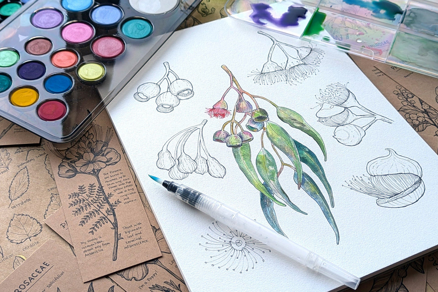
6. Botanical Illustration: Precise Observation and Fine Technique
Year level: Years 5-8
Curriculum focus: ACARA Science code AC9S5U01 (Biological sciences), Visual Arts code AC9AVA6E01 (Exploring and practising art techniques)
Technique: Fine detail work, precise colour mixing, balancing detail with restraint
Botanical illustration is observation drawing filled with watercolour. It's precise without being sterile. Students choose a plant (local native species, a garden plant, a vegetable from the school garden) and draw it carefully in pencil, noting every leaf shape, vein, texture.
Then they paint it in watercolour using careful, controlled technique. Subtle shadows give form. Carefully mixed greens avoid the artificial look. Fine brushwork shows the textures of bark, leaf surfaces, flower detail.
This teaches patience and precision. There's no rushing. The work develops over multiple lessons.
Why it works: It's authentic scientific practice paired with artistic skill. Botanical illustration is a real discipline with hundreds of years of history. Students feel like they're doing genuine work, not school busywork.
Materials: Watercolour pans, fine detail brushes, watercolour paper or watercolour journal paper, two water containers, magnifying glasses, pencils (2H or H for light marks that don't show), erasers, reference images of botanical illustrations
Classroom tip: Show real historical botanical illustrations. Real artists (Pierre-Joseph Redouté, for example) to show students this is a respected artistic tradition.
7. Australian Seascapes: Salt Techniques, Lifting, and Texture
Year level: Years 4-6
Curriculum focus: ACARA Science code AC9S4U02 (Earth and space systems), Visual Arts code AC9AVA6E01 (Exploring and practising art techniques)
Technique: Wet-on-wet for water, salt for texture, lifting colour for highlights, atmospheric perspective
Seascapes teach water painting combined with texture techniques. Students paint an Australian coastline (Bondi, Great Ocean Road, a local beach, tropical reef).
The water and sky go in wet-on-wet, creating soft, flowing colour. While still wet, students sprinkle salt on the surface. The salt draws up water and creates irregular texture, like waves and foam.
Once dry, students lift colour (using a damp, clean brush to remove paint) to create highlights where light hits the water and sand. This creates luminosity and movement.
Why it works: The technique (salt, lifting) creates effects that feel like happy accidents, but they're actually controlled techniques. Students learn that watercolour has tricks that create magic if you understand the chemistry.
Materials: Watercolour pans, soft brushes, watercolour paper, table salt, two water containers, sponges, reference images of Australian coastal scenes
Classroom tip: The salt trick never gets old. Even older students (Year 7-8) are delighted when they discover that sprinkling salt creates texture. Use it as a moment of genuine discovery.
8. Shadow and Light Studies: Still Life and Tonal Range
Year level: Years 5-8
Curriculum focus: ACARA Visual Arts code AC9AVA6E01 (Exploring and practising art techniques), Science code AC9S5U03 (Physical sciences—light)
Technique: Observing shadows, graded washes for tonal range, using colour to show light and shadow
Still life with strong lighting teaches observation of shadow and form. Set up a simple arrangement of objects (fruit, jars, fabric, flowers) with a strong light source casting clear shadows.
Students observe and paint the tonal range: the brightest lights, the darkest shadows, all the mid-tones between. In watercolour, this means starting light and building slowly to dark. Students discover they can't easily add light back once it's dark; they have to plan the lightest lights first.
This teaches restraint and planning.
Why it works: Real still life observation is more engaging than copying a photo. Students see light and shadow in three dimensions and learn to translate that onto flat paper.
Materials: Watercolour pans (especially useful: greys, browns for shadow colours), brushes (medium and fine), watercolour paper, two water containers, real objects to paint from, pencils for sketching composition
Classroom tip: Have students identify the light source first. Where is it? What colour is the light (warm, cool, neutral)? Shadows are never black; they're a darker version of the complementary colour (if an object is red, its shadow is greenish-dark). This observation step transforms the quality of the painting.
9. Aboriginal-Inspired Colour Palettes: Cultural Respect and Earth Tones
Year level: Years 3-8
Curriculum focus: ACARA Visual Arts codes AC9AVA6E01 (Exploring and practising art techniques) and AC9AVA6E02 (First Nations Australians and visual arts)
Technique: Working with limited, warm colour palettes, mixing earth tones, understanding the colours of the Australian landscape
This lesson explores the earth-tone colour palette of the Australian landscape through an artist's lens. Not imitating Indigenous art, but exploring the ochres, siennas, umbers, and warm earth colours that characterise the Australian continent.
Students work with a limited palette: raw sienna, burnt sienna, yellow ochre, raw umber, burnt umber, white, and a touch of blue or green for variation. They paint a landscape or abstract composition using only these colours, discovering the subtle variations and depths within a warm, earthy palette.
This teaches colour harmony through constraint and deepens appreciation for the colours embedded in the Australian landscape.
Why it works: Working with a limited palette forces thoughtful colour mixing rather than random colour selection. Students discover that you don't need many colours to create visual depth and interest.
Materials: Watercolour pans (emphasising earth tones), brushes, watercolour paper, two water containers, reference images of Australian landscapes and ochre sites
Classroom tip: Discuss colour respectfully. Explain that many traditional cultures across Australia developed knowledge of ochre and earth pigments over thousands of years. This lesson respects that knowledge by exploring the colours with intention and care.
10. Port City History: Architecture and Layered Landscape
Year level: Years 5-8
Curriculum focus: ACARA Humanities code AC9HS6K05 (Society and environment), Visual Arts code AC9AVA6D01 (Developing ideas in response to theme)
Technique: Wet-on-wet for atmospheric skies, wet-on-dry for architectural detail, perspective and scale
Many Australian cities began as ports: Sydney, Melbourne, Hobart, Fremantle. Historic port scenes combine water, architecture, sky, and human activity.
Students research a historic Australian port scene (from photos, paintings, archival images). They paint the scene, starting with wet-on-wet for the water and sky, then building architectural detail (buildings, ships, wharves) with careful dry-brush technique.
The challenge is atmospheric perspective: distant buildings are smaller, fainter, cooler in colour. Near buildings are detailed, darker, warmer. Watercolour's transparency helps achieve this naturally.
Why it works: History, geography, and art integrate. Students aren't just learning to paint; they're exploring their nation's maritime history.
Materials: Watercolour pans, brushes (various sizes), watercolour paper, two water containers, reference images of historic Australian port scenes, pencils for perspective sketching
Classroom tip: Research real historic scenes together. Look at primary sources if available. Then students create their interpretation in watercolour rather than copying a photo.
Classroom Setup Revisited: Materials for 25 Students
Watercolour pans: A student set typically has 12 colours. For a class of 25, options are:
- Five complete student sets, shared among groups of five
- Two teacher sets (24 colours each) set up at paint stations
- One large teacher set (40+ colours) at a central mixing station with students sharing brushes and colours
Brushes: Students need three: large soft (for washes), medium round (for general work), fine round (for detail). Buying a set per student is expensive. One set per pair, or five sets shared among eight students, is more economical.
Paper: Watercolour paper (cold-pressed, 200gsm or heavier) is more expensive than copier paper but essential. A ream of watercolour paper (500 sheets) costs roughly three times the price of copier paper. For a class of 25 with two lessons per week, budget 50 sheets per week.
Water containers: Pre-filled water containers reduce setup time. A water container per student, refilled or replaced halfway through, is ideal.
Drying space: A wire shelving unit dedicated to drying works well. Line the shelves with newspaper, space paintings so they don't touch.
Total materials cost for one 10-week term of weekly watercolour lessons (class of 25):
- Watercolour paper: ~$150-200
- Paint (if starting from scratch): ~$50-100
- Brushes (if starting from scratch): ~$30-50
- Water containers (if using clear plastic cups, minimal cost)
- Other supplies (palettes, sponges, salt): ~$20
This is a reasonable investment for a term of engaging, curriculum-linked art education.
Why Watercolour Deserves a Place in Every School
Watercolour teaches restraint, observation, and respect for materials. It teaches that you can't control everything; you work with the medium's properties rather than against them.
In a culture where students are often encouraged to "fix" mistakes, watercolour teaches that mistakes become part of the artwork. A bloom of colour that spreads unexpectedly isn't a failure; it's an opportunity. A hard edge where you didn't plan one becomes the basis of your composition.
These are resilience skills that extend beyond art.
The lessons in this series connect watercolour to Australian themes, curriculum outcomes, and genuine skill development. With proper classroom setup, watercolour becomes not just manageable but joyful. Teachers report students engaged differently with watercolour than with other media. Less rushing, more exploration. More "happy accidents" used intentionally, fewer frustrated tears.
Your classroom setup matters. Get the paper right, manage water well, and plan for drying. Everything else follows.
Ask Klumpf about watercolour in school, class-friendly setups, or which paper survives a primary class. Micador's in-house art expert. Bottom-right of every page.
Next in this series: "Painting Across the Curriculum"
© 2026 Micador Group. All rights reserved. This article is original editorial content produced by Micador. You're welcome to link to it or quote short passages with attribution. Reproducing the article in full, or republishing it on another platform, requires written permission — amazing@micador.com.au.
Leave a comment
All comments are moderated before being published.
This site is protected by hCaptcha and the hCaptcha Privacy Policy and Terms of Service apply.