Acrylic paint is the workhorse of primary school art classrooms. It's opaque, forgiving, vibrant, and it dries fast. Unlike watercolour, which requires careful water control and top-quality paper, acrylics bounce back from beginner mistakes. Unlike oil paint, there's no toxic solvents or ventilation concerns. Teachers like acrylics because they deliver visible results quickly. Students like them because the colours stay bright and bold.
But knowing acrylic is valuable isn't the same as knowing what to actually paint.
This post maps 10 acrylic lessons to the Australian Curriculum, each with a specific focus on technique, Australian context, and why it works in your classroom. Each lesson builds on earlier learning. You can run them sequentially through a term, or pick and mix depending on what suits your year level and term focus.
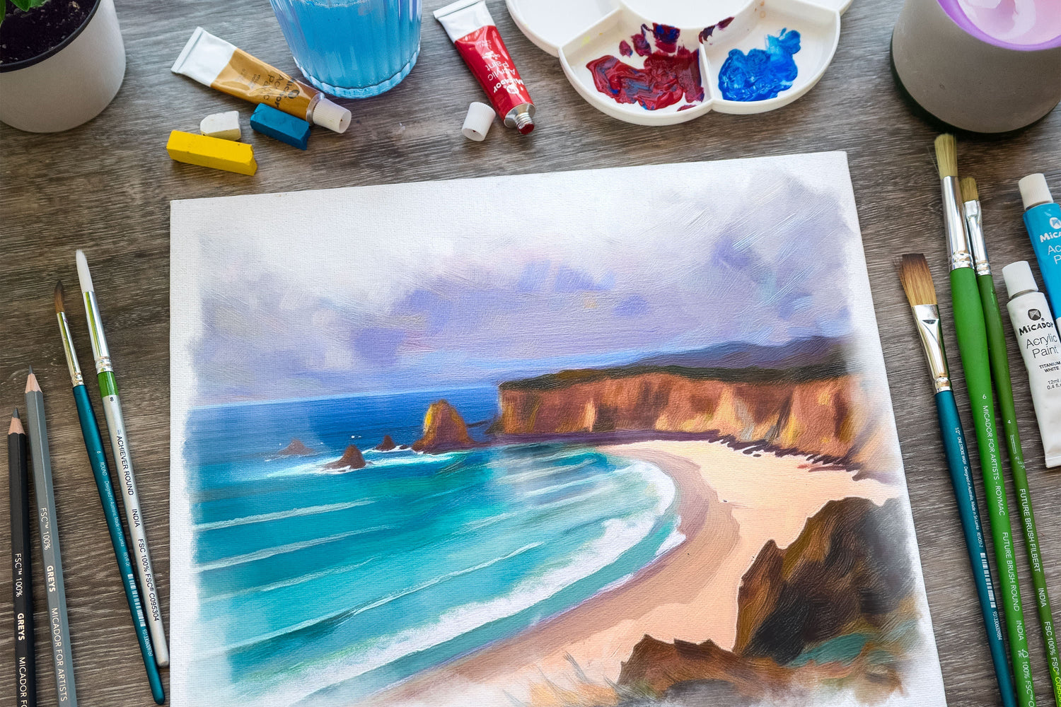
1. Bush Fire Recovery Landscapes: Colour Contrast and Layering
Year level: Years 4-6
Curriculum focus: ACARA Visual Arts code V9AR7 (Exploring and practising art techniques)
Technique: Warm and cool colour contrast, layering, expressive brushwork
Students paint a landscape showing fire recovery. Think charred trees against new green growth, golden evening light on regenerating bushland. The visual drama is built entirely on colour choice.
Start by discussing Australian landscapes after fire. Show images of regrowth. Banksia cones opening after fire, pioneering plants. Then introduce the colour pairs: warm oranges and reds against cool blues and greens. The contrast between these colour groups creates the emotional tension the landscape needs.
Students sketch a simple landscape composition, then layer warm colours first (the burnt areas or sunset glow), then cool colours (new growth, sky, water). They discover that acrylic covers warm with cool beautifully, so mistakes become part of the narrative.
Why it works: The environmental theme gives meaning to the technical learning. Students aren't just learning colour contrast; they're using it to tell a story about resilience.
Materials: Acrylic paint (reds, oranges, yellows, blues, greens, white, black), brushes (round and flat), 200gsm paper or pre-stretched canvas boards, water containers, palettes
Classroom tip: Set up paint stations rather than giving each student a full paint set. One mixing station per four students reduces paint waste and encourages colour experimentation. Mix a bulk beige (burnt sienna + white) ahead of time for faster sky washes.
2. Great Barrier Reef Ecosystem: Transparency and Colour Mixing
Year level: Years 3-5
Curriculum focus: ACARA Science code SC4ES06 (Earth and space systems), Visual Arts code V9AR5 (Developing ideas in response to theme)
Technique: Layering translucent colour, colour mixing for natural coral tones, wet-on-wet for water effects
The Great Barrier Reef is a natural starting point for colour mixing. Students research actual coral colours (soft pinks, deep purples, oranges, yellows) and create a palette before painting. This is science and art at once.
The lesson structure: sketch an underwater scene with coral, fish, anemones, and rocks. Start with a very diluted blue wash for water, let it dry slightly (acrylics dry quickly). Layer lighter colours on top to show fish and coral. Because acrylic dries opaque, students can paint delicate fish details over the water without losing the background.
The key discovery is that you can't easily paint dark over light with acrylic (unlike watercolour where you just leave paper white). This teaches them to plan the order of layers.
Why it works: The science connection makes colour mixing purposeful. Students aren't mixing arbitrary colours; they're matching what coral actually looks like.
Materials: Acrylic paint (cobalt blue, turquoise, reds, oranges, yellows, whites, blacks), medium and fine brushes, 200gsm paper, water containers, reference images of reef creatures
Classroom tip: Pre-paint the water background yourself, or demonstrate it and let students do a shared base layer. This saves time and lets you focus the lesson on coral and fish detail work.
3. Australian Street Art Study: Bold Composition and Graphic Colour
Year level: Years 4-6
Curriculum focus: ACARA Visual Arts code V9AC08 (Analysing and responding to art) and V9AR8 (Presenting artwork)
Technique: Bold colour application, graphic composition, scale and impact
Take your students on a virtual tour of Melbourne's laneways. Project images of street art from ACARA's visual arts resources or local Melbourne artists. Discuss what makes street art visually powerful: strong silhouettes, bold colour, simple composition that reads from a distance.
Then set a challenge: create a bold graphic composition using only acrylics. The design could be a street art-inspired creature, a portrait in graphic style, a pattern composition. Emphasis on bold, simple shapes and high-contrast colour.
The lesson teaches students that "finished" doesn't mean "realistic". A graphic, stylised artwork with three strong colours can be more powerful than a photorealistic painting with dozens of colours.
Why it works: Connects visual arts to actual contemporary art they see in their community. Year 5-6 students especially respond to feeling like they're creating "real art", not just school worksheets.
Materials: Acrylic paint (primary colours plus white and black), large brushes (flat and mop brushes for bold application), 200gsm paper (A3 or larger for impact), markers or charcoal for sketching outlines
Classroom tip: Have students sketch their design heavily in black first, outlining simple shapes. This gives a street art aesthetic and makes the painting stage faster.
4. Multicultural Portrait Project: Skin Tone Mixing and Identity
Year level: Years 3-6
Curriculum focus: ACARA Visual Arts code V9AR4 (Developing personal style), ACARA Humanities code HU4KI03 (Community identity)
Technique: Colour mixing, realistic skin tones, self-expression through art
This is where acrylic teaches a real skill that matters: mixing skin tones. Many young students default to "peach" for skin, then get frustrated when it doesn't match their own skin or their friends' skin.
Start with a colour-mixing investigation. Show students how to mix skin tones from primary colours. Red + yellow = orange. Orange + white = peach. But peach doesn't suit everyone. Add more red for warmer tones. Add more yellow for golden tones. Add a tiny bit of blue or green to desaturate and create depth.
Students paint a self-portrait (head and shoulders) that reflects their cultural heritage or identity. They might wear traditional clothing, show cultural symbols, incorporate family patterns or colours. The portrait is acrylic on paper or canvas board.
Why it works: The practical skill (mixing accurate skin tones) directly supports the creative goal (creating an authentic self-portrait). Students see that learning techniques matters because it lets them express what they actually want to express.
Materials: Acrylic paint (all colours, with extra reds and yellows), fine and medium brushes, 200gsm paper or canvas boards, mirrors, pencils, erasers for sketching
Classroom tip: Do a whole-class colour-mixing demo. Have five students with different skin tones come forward and help you mix their actual skin tone. This takes the awkwardness out of discussing skin colour differences and shows that variety is normal and beautiful.
5. Arthur Boyd Landscapes: Expressionist Technique and Australian Art History
Year level: Years 5-6
Curriculum focus: ACARA Visual Arts code V9AC01 (Responding to and analysing artworks), V9AR7 (Exploring and practising art techniques)
Technique: Loose brushwork, expressionist mark-making, colour for emotion not accuracy
Arthur Boyd is an Australian master whose landscape paintings are expressive rather than realistic. His brushwork is loose, energetic, and emotional. His colours are often exaggerated.
Show students three Boyd landscape paintings. Ask them: What colours did he choose? Are they realistic? What feeling do these colours create? Does the brushwork look careful or energetic? Notice how he uses colour and gesture to show emotion, not just to copy nature.
Then set them a challenge: paint an Australian landscape (yours, your state, somewhere significant) using loose, expressive brushwork and exaggerated colour. They're not trying to make it look real; they're trying to make it feel something.
This is liberating for students who think art has to be photorealistic. It opens the door to artistic expression.
Why it works: Studying a real artist's work gives students permission to be expressive. They're not being "wrong"; they're being inspired by an actual art movement.
Materials: Acrylic paint (all colours), flat and mop brushes for loose application, 200gsm paper or canvas boards, reproductions of Arthur Boyd works (widely available online through National Gallery resources)
Classroom tip: Keep a Boyd image projected during the lesson. When students get stuck or think their painting is "wrong", direct them back to the image to remember that loose and expressive is the goal.

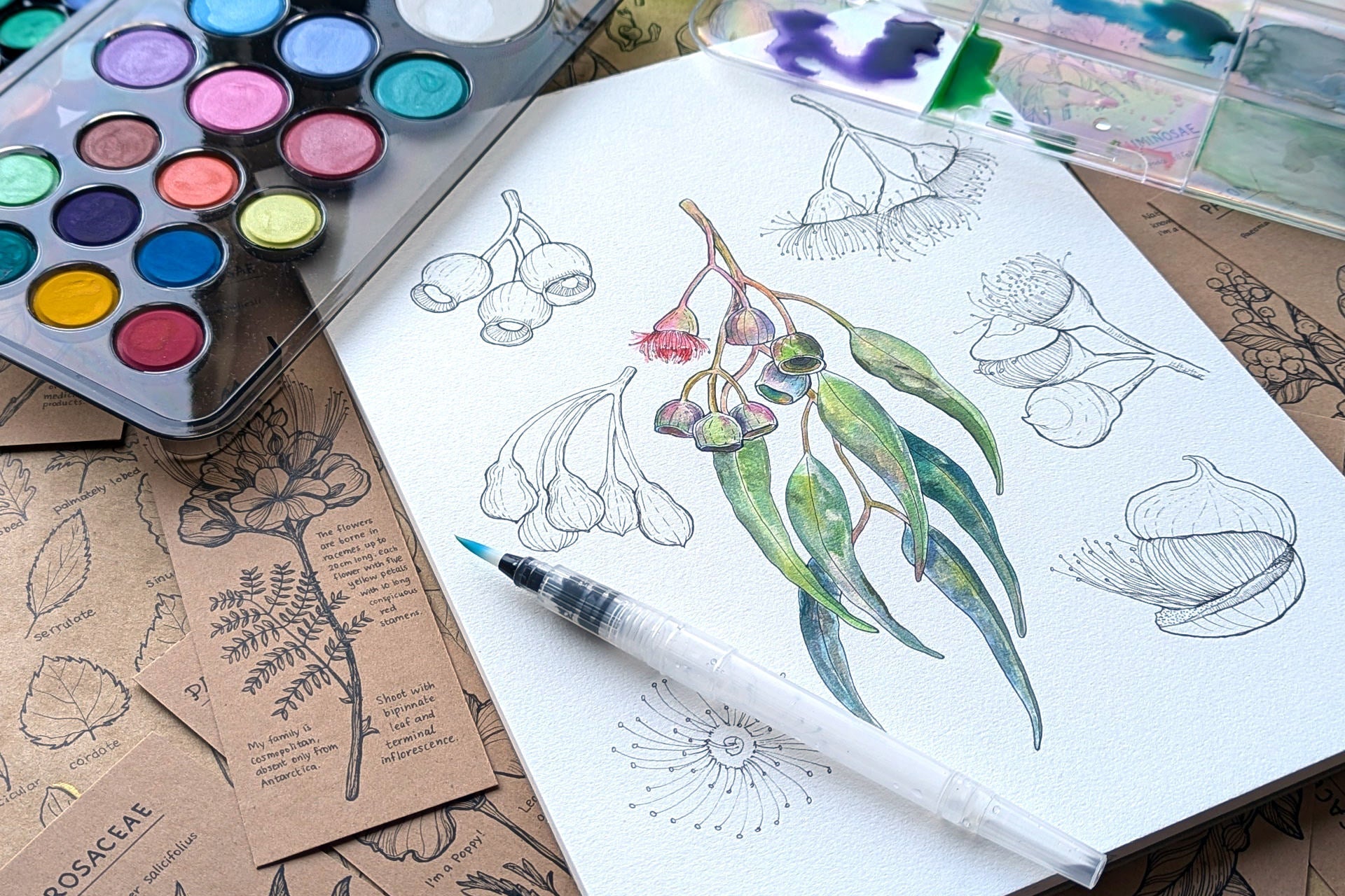
6. Native Plant Studies: Botanical Detail Meets Bold Background
Year level: Years 3-6
Curriculum focus: ACARA Science code SC4FB02 (Biological sciences), Visual Arts code V9AR4 (Developing personal style)
Technique: Fine detail work, background techniques, composition balance
Australian native plants are stunning: banksias with their sculptural flower spikes, waratahs with their intense red depth, eucalyptus leaves with their subtle colour. This lesson combines botanical observation with artistic choice.
Students research one Australian native plant. They sketch it carefully, observing the exact shape of leaves, flowers, seed pods. Then they paint it in acrylic, starting with a bold, simple background (could be a single colour wash, a gradient, a pattern) and layering fine detail on top.
The composition challenge is balance: a tiny delicate plant would get lost on a big canvas, so students learn to enlarge the plant or create visual weight through background colour or pattern.
Why it works: The observation skill (from science) combines with the artistic technique (from art). Students develop patience for detail work, plus they learn that sometimes bold, simple backgrounds make small details sing.
Materials: Acrylic paint (all colours), fine brushes for detail work, flat brushes for background, 200gsm paper or canvas boards, magnifying glasses, reference images of native plants, pencils for detailed sketching
Classroom tip: Have students paint their background first and let it dry fully before adding plant detail. Acrylic's quick drying makes this easy.
7. Climate Data Art: Visualising Invisible Information
Year level: Years 5-6
Curriculum focus: ACARA Maths code M5DP01 (Data representation), Science code SC5ES01 (Earth and space systems), Visual Arts code V9AR5 (Developing ideas in response to theme)
Technique: Colour as information, mixed media, conceptual art
This is a creative extension of data literacy. Students take real climate data (temperature over a year, rainfall, sea level rise) and translate it into visual form using colour and paint.
For example: a temperature chart becomes a painting where cool blues represent winter months and hot reds represent summer. The intensity of colour shows the intensity of temperature. Or rainfall data becomes layers of paint, with thicker, more opaque layers showing heavy rain months.
This isn't realistic painting; it's conceptual art where the visual language (colour, opacity, composition) communicates data.
Why it works: It's problem-solving through art. Students aren't copying nature; they're inventing a visual system to communicate something abstract. This teaches that art is a communication tool, not just decoration.
Materials: Acrylic paint (a full range of colours), brushes (various sizes), 200gsm paper or canvas boards, rulers, pencils, printed climate data, collage materials (optional)
Classroom tip: Work through one data set together as a whole class first. Decide together how colour will represent temperature (cooler = blue, warmer = red, for example). Then students create their own for a different data set or location.
8. Community Mural Design: Collaboration and Large-Scale Planning
Year level: Years 4-6
Curriculum focus: ACARA Visual Arts code V9AR8 (Presenting artwork), ACARA Humanities code HU4KI03 (Community identity)
Technique: Scaling up, grid transfer, collaborative painting, surface preparation
A mural project teaches planning and collaboration. This works best as a culmination activity or term project rather than a single lesson.
The process: students brainstorm a community theme (local history, nature, school values). They design a mural composition on paper. They decide: what should go in the centre? What surrounds it? What colours represent our community? They vote or collaborate on a final design.
Then: grid the design (divide into squares, number them), scale it up onto a large surface (a school wall, a plywood sheet, a canvas drop cloth), and paint it. This teaches spatial reasoning and teaches that planning matters before you start painting.
Why it works: It's authentic work. Real walls, real community impact, real collaboration. Students feel like they're creating something that matters.
Materials: Acrylic paint (bulk quantities, possibly donated or purchased in large tubs), large flat brushes and mop brushes, gridded paper for design, chalk or pencil for scaling up, the surface to be painted (wall or large substrate), protective coverings
Classroom tip: Divide the mural into sections and assign small groups to each. This prevents wait time and keeps momentum. Have a clear colour guide so all sections feel cohesive.
9. Metamorphosis Series: Sequential Art and Science Connection
Year level: Years 3-5
Curriculum focus: ACARA Science code SC4FB06 (Ecosystems), Visual Arts code V9AR5 (Developing ideas in response to theme)
Technique: Consistent style across multiple paintings, colour consistency, narrative sequencing
Students choose a transformation: butterfly lifecycle (egg, caterpillar, chrysalis, butterfly), seed to mature tree, tadpole to frog. They create four paintings showing the stages of transformation.
The technical challenge: keeping the style and colour palette consistent across all four so the series feels connected. If one painting is realistic and one is loose, they feel like different artists' work.
This teaches planning and consistency, not just individual painting skills.
Why it works: The science gives structure to the art project. Students understand why each stage matters and how to show change visually.
Materials: Acrylic paint (consistent palette across all four paintings), brushes, 200gsm paper or canvas boards (four pieces per student or small group), reference images of lifecycle stages, pencils for sketching
Classroom tip: Have students choose one colour for each stage (green for growth, brown for decay, bright for adult form, for example). This gives visual coherence to the series.
10. Bioluminescence: Glow Effects and Dark Backgrounds
Year level: Years 4-6
Curriculum focus: ACARA Science code SC4FB06 (Ecosystems), Visual Arts code V9AR7 (Exploring and practising art techniques)
Technique: Light colour on dark grounds, opacity and transparency play, scientific observation
Bioluminescence is light produced by living organisms. Glow worms light up Australian caves. Certain jellyfish and deep-sea fish glow. It's visually spectacular and scientifically fascinating.
The lesson: paint bioluminescent creatures on very dark backgrounds (navy, deep purple, black). Use lighter, brighter colours for the glowing parts. The contrast between dark and light creates the illusion of luminescence.
Students research actual bioluminescent organisms (Australian glow worms, anglerfish, comb jellies) and paint them in acrylic.
Why it works: The science observation feeds directly into the artistic technique. Understanding how bioluminescence works makes the painting choice obvious: light colours on dark ground.
Materials: Acrylic paint (a full range plus blacks, navies, deep purples for backgrounds; bright whites, yellows, neon-bright acrylics if available for glow), brushes, black or very dark 200gsm paper or pre-painted canvas boards, reference images of bioluminescent organisms, pencils for light sketching (charcoal on dark paper)
Classroom tip: Pre-paint dark backgrounds if time is limited. Then students focus on the technical challenge of painting luminescent creatures with appropriate colour and light effects.
Classroom Setup for Acrylic: Practical Considerations
Acrylic is forgiving in paint, but it requires intentional classroom setup.
Table coverings: Acrylics stain permanently. Use plastic table covers, newspaper, or old vinyl. They're not optional.
Smocks: This is critical. Acrylic on clothing is permanent. Every student must wear a smock or old clothes.
Water stations: One water container per student minimum. Acrylic is water-soluble while wet but dries insoluble, so clean water matters. Have students change their water at least twice during a lesson.
Drying space: Designate a flat drying area. A shelving unit or windowsill where paintings won't be knocked over. Acrylic dries fast (within minutes) but paintings still need handling care.
Paint preparation for 25 students: Rather than one complete paint set per student (expensive and wasteful), set up paint stations. Two or three stations serving groups of eight to ten students is more efficient. Bulk out white paint; acrylics use a lot of white for tinting.
Paint in dispensable quantities: Use paint palettes or ice-cube trays. A small squeeze bottle of white paint and basic colours at each station prevents students from over-mixing or wasting.
Cleanup: Acrylic paint becomes plastic as it dries on brushes. This isn't reversible. Establish a rule: clean brushes immediately. A rinse jar at each station, then clean running water. Uncleaned acrylic brushes are wasted brushes.
Why Acrylic Works for Primary Classrooms
Watercolour teaches transparency. Oil teaches blending and subtle colour mixing. But acrylic teaches coverage, opacity, and quick results. In a primary school context where you've got 25 students and one hour, acrylic delivers. Students see finished work. They practice colour mixing, layering, and composition. They produce something they're genuinely proud of.
The lessons in this series work because they're rooted in real technique, Australian themes and contexts, and genuine curriculum links. They're not art-by-numbers. They're teaching actual skills through projects that matter.
Your students will come away with acrylic skills they can use across multiple projects. More importantly, they'll understand that paint is a language for expressing ideas, observing the natural world, and telling stories about their community and their country.
Ask Klumpf about teaching acrylic, lesson sequences, or what to do when 30 kids hit one paint pot. Micador's in-house art expert. Bottom-right of every page.
Next in this series: "Watercolour in the Classroom: Lessons Mapped to the Australian Curriculum"
© 2026 Micador Group. All rights reserved. This article is original editorial content produced by Micador. You're welcome to link to it or quote short passages with attribution. Reproducing the article in full, or republishing it on another platform, requires written permission — amazing@micador.com.au.
Leave a comment
All comments are moderated before being published.
This site is protected by hCaptcha and the hCaptcha Privacy Policy and Terms of Service apply.